
Power BI is an excellent tool for graphical visualizations. It comes up with great plotting capabilities. At the same time, it offers a lot of depth for tabular visualizations as well. The table and matrix visualization helps to display categorical variables with text labels in the report. In this post, we will discuss Table and Matrix Visualization in Power BI.
Let’s have a look at the topics of discussion.
- What is Table Visualization?
- What is Matrix Visualization?
- Load Data into Power BI
- Create Power BI Table Visualization
- Create Power BI Matrix Visualization
- Difference between Table and Matrix Visualization
- FAQ
- Conclusion
What is Table Visualization?

Table visualization is just a normal grid containing related data in rows and columns. It can have headers and only rows. Users can create tables in reports and cross highlight elements within the table. They can also select individual cells, rows, and columns. They can copy and paste individual cells and multiple cell selections into other applications. We will implement Table Visualization further in this blog.
What is Matrix Visualization?

Matrix visualization is very similar to table visualization. In table visualization, data is present in a two-dimensional format. But Matrix visualization can display data in multiple dimensions. It provides full support for stepped layout. The Matrix aggregates the data itself and lets users drill down. Users can create matrix visuals by using Power BI Desktop and cross-highlight elements within the matrix. There are numerous features present in Matrix visualization. Let’s discuss them further in this blog.
Also Read: MSBI vs Power bi , to know the major differences between them.
Load Data into Power BI
Now, we will see the demonstration of Loading Data into Power BI to create table and matrix visuals. We will use a sample CSV file to load data into Power BI Desktop. This file contains sample data of Indian users spending money with certain credit card types on their expenses. This sample file has more than 26k rows and six columns as City, Date, Card Type, Exp Type, Gender, and Amount.
Let’s load the file into Power BI Desktop.
Step 1) Open the Power BI Desktop App. A home screen of Power BI will be visible.
Step 2) To load the data, click on Get Data. It displays the various file types to upload. As our sample file is of CSV type, click on CSV.

Step 3) Browse the file location and select it. Now Power BI Desktop will show the preview of the data contained in the file. You can verify your file by looking at the previewed data and clicking on load.

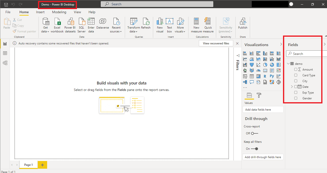
Step 4) Now the file has been uploaded. You can see your data in Field Pane and save the dashboard.
Check out: Power BI Real-Time Data Streaming
Create Power BI Table Visualization
Step 1) You can find the table chart option in Visualization Pane.

Step 2) Click on the table icon as shown above in the picture. It will create an empty default table in the canvas.

Step 3) Now you need to fill up the arguments under the Value option. For that, drag and drop variables into Values. It will create a table. Here, we have added card type, city, amount. It will form a table as shown below.

Step 4) Card Type and City variables contain text labels and are known as categorical variables. Table visualization comes in handy to visualize many labels in a category as it is hard to visualize them otherwise. By default, the amount type is a sum. You can change the amount to minimum, maximum, average, and many other options available, as shown in the image.


Check out: Data Analysis in Power BI
Formatting Options for Power BI Table Visualization
There are many options available in Power BI Desktop to format a table. The table we created above is ready, but it requires some formatting to look visually attractive. We will see the Column Header under the Format pane.

Step 1) You can set the font color, background color, outline. Let’s see in the image how does it make a difference.

Step 2) You can also change the font family, text size, and alignment as shown in the image.

Step 3) There are many other options available which you can use on your own very easily. You can also scroll up and down the table with the hover tools.

Now, we will see how to create Matrix Visualization.
Create Power BI Matrix Visualization
Table visualizations are an excellent way to create visuals for multiple labels under the same category. But still, it lags to provide more granularity into your chart. To overcome this, Matrix visuals come into play.
Step 1) To add a Matrix to your canvas, click on the Matrix option under Visualization Pane.

Step 2) Now you can fill in the Matrix with data. In this demo, we drag and drop the Card Type in the Rows, Date in the column, and Amount in the values as shown below. It also shows the hierarchy for the date as Year, Quarter, Month, and Day. You can choose any hierarchy. We are choosing the year for this demo.

Also check out: Power Query in Power BI
Let’s see the Formatting options for Power BI Matrix VisualIzation.
Step 1) To format the Matrix, go to Format Pane and click on column headers. You can change the font color, background color, and outline according to your convenience.

Step 2) You can also change the Font Family, Text alignment, and Title alignment.

Step 3) You can go to Row Header and change the font colour, background colour, and font size very easily. Everything is customizable and easy to understand.

Step 4) To add more values, go to the fields section and drag and drop the data you want to add. We are adding a city here. Users can scroll back and forth to view the information.

Let’s have a discussion on the difference between Table and Matrix Visualization.
Difference between Table and Matrix Visualization
Let’s have a look at the difference between Table and Matrix Visualization in Power BI.
| Table Visualization | Matrix Visualization |
| Tables represent data in 2-Dimensional form. | It supports a multidimensional data grid format. |
| Rows are not fixed in a table, but the column does. | Both rows and columns are not fixed. |
| It follows a flat data structure and displays all data. | Data is automatically aggregated in Matrix as per the behaviour of the data. |
| Users can add a new dimension as “Values” only, and it acts as a column. | Matrix offers to add values, rows, and columns. |
Let’s have an eye on the most frequently asked questions.
FAQ
Q1. What is the difference between table and matrix visual in Power BI?
Ans: The table only displays the data in two dimensions whereas Matrix visualizations allow options to display data as a table, let the user specify rows and columns, and layer the data.
Q2. How do you use matrix visualization in Power BI?
Ans: It is very simple to create matrix visuals in Power BI Desktop reports. You can cross-highlight elements within the matrix such as highlighting rows, columns, or individual cells.
Q3. Is a matrix a table?
Ans: We can use the matrix to store data in a structured format. Matrix is a grid that is often used synonymously with a table. Matrixes are more flexible as compared to tables.
Q4. When would you go from using a table Visualisation to using a matrix?
Ans: Tables visual is used to display information in the 2D form with fewer number values per dimension. Matrix is preferred in those cases where data has many dimension values and you want to format it for a better user experience.
Q5. Does DAX have one value?
Ans: Dax does have one value and it returns true when it has one value in a specified column.
Conclusion
Data is generating exponentially on a daily basis. This increases the demand for multivariate reporting to understand the data and its relationship meaningfully. Nowadays, as a Data Analyst, you can be asked to present data in multiple dimensions. Table and matrix visualization options can help you deal with variables of textual nature and present data insightfully.
References
- Introduction to Microsoft Power BI Platform | Everything You Must Know
- Exam PL-300: Microsoft Power BI Data Analyst | A Replacement Of DA-100
- Microsoft Certified Data Analyst Associate [PL-300] Step By Step Activity Guides (Hands-On Labs)
- Case Study: Display Live Data Streaming Using Power BI Service
- Introduction to Data Modeling in Power BI
- What is Power Query | Microsoft Azure Power BI Tool
- Top 15 Differences Between SSRS vs Power BI
- How to Become a Power BI Developer?
Next Steps to begin with PL-300 Certification:
In our PL-300 Certification Training Program, we’ll cover 10+ Hands-On Labs. If you wish to start your journey towards becoming a Microsoft Certified: Power BI Data Analyst Associate, try our FREE CLASS.

The post Table and Matrix Visualization in Power BI appeared first on Cloud Training Program.